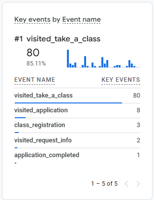
I understand that people may find they’re not interested in a class after viewing its information, but I also think that only 1/10 of people attempting an application is too large of a gap. Personally, I find that there are too many clicks in the application process.
When you search for NWTC class application, the page that appears a couple of slots above the actual class search page in the organic search results is the “how to” page. Going to that page requires another click to reach the search page. Therefore, I think that SEO should prioritize the search page rather than the information page as current students know what they’re looking for, and it shouldn’t necessarily be too difficult for new students to figure out either.
In addition, I find the “more details” button about a class to be an unnecessary click to reach the application button. It’s important to have in case people want more information, but I believe all of the important information can be/is shown on the card itself. Therefore, “more details” should be accompanied by the application button.
Finally, class search is a little too buried in the student portal. Canvas, email, class search/application, and finances are really the only things I use the student portal for, so the highly used buttons should be included in the header.