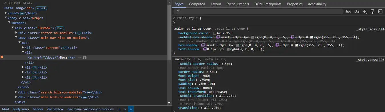
Extract UI Items

website navigation anchor hover ui
Anchor UI

Anchor Hover State

UI Item - Summary

When you hover over an anchor with your mouse, the state changes. It looks indented to provide the illusion that you're pressing a button. I like it because of that connection to the physical world. Plus, I can definitely tell if my mouse is actually over the link.

UI Item - Techniques

All that was changed was the colors and shadows of both the text and the background. I didn't notice the text shadow at first because it is subtle. What makes it indent is the inset property, which uses two different colors to differentiate the borders.

wrapping text block triangle corner
Wrap UI

Wrapping Text Block

UI Item - Summary

Not only does the text block spill off the page, but it also looks 3D as a result of wrapping around the back. It's cool because it makes it feel like a note that was stuck onto the page rather than just more content.

UI Item - Techniques

I know how they did everything except for the triangle shape. It's positioned at the start of the text, so they just move it over with negative positioning. It shows up in the first place because blank content is given a border. I feel like that would be square, but maybe there's some other css that styles blank text.

line break between posts
Line Break

Line Break Between Posts

UI Item - Summary

This one is just a simple line separating posts, but I wanted to include it because I thought it was a styled br. It turned out to be a styled border on the article element which gives the illusion of a break.

UI Item - Techniques

Border and box shadow provide the color and thickness of the line, same as any other use. However, the article element defaults to having rounded corners, probably set somewhere else, so border radius needs to be set to 0 to fully complete the line.

block to differentiate code
Code Block

Code Block Header

UI Item - Summary

I thought the code block was cool because it looks like any other code block you'd find on the internet. However, I want to focus on the header specifically because that's more interesting. It looks rounded and spans a decent amount of the page.

UI Item - Techniques

The rounded look turned out to just be a gradient with the same color on either side. As far as I can tell, the rest of the illusion is just made up by your brain. As for spanning far, it uses a table layout and 100% width.