Code
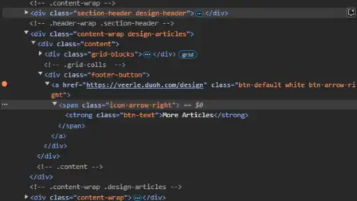
One random feature I wanted to check was how the "to top of page" button worked. I didn't see any # in the URL after clicking it, which I remember being the method mentioned in class. It still does use the #, but there’s a 0 after it (#0). Apparently, putting any characters after the # allows it to function while keeping the URL clean. In addition, some buttons on the page display an arrow that slides to the right when hovering, and my initial assumption was it used transforms and visibility. Looking at the HTML on this assumption confused me because there was no element specific to the arrow. The answer is so much simpler: the arrow is set as the background image, and the background position changes.
UI
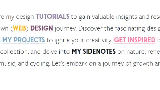
First of all, way too many colors are used. I don’t have a problem with any of the colors specifically, and I still think they complement each other, but the combination of them all together is overwhelming. In addition, every page uses slightly different sizes and layouts for their content, which is fine for the pages separately. However, the home page combines snippets of all pages, so can you guess what happens? It becomes difficult to keep track of what you’re looking at on the home page.
UX
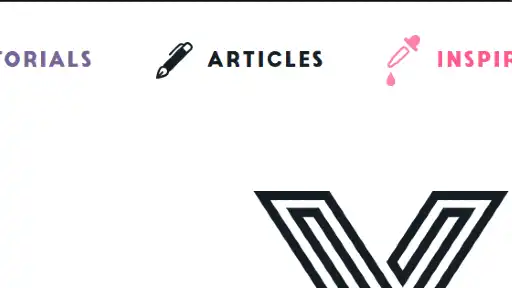
While the site is overwhelming, I briefly mention that above instead of here because I wanted to save the UX section for a couple of confusing moments I had. First, looking at the navigation for the first time made me think the default page was randomly “inspiration.” Then, I thought I could also be the “tutorials” page (both page tabs are different colors). The home page was actually represented by the “V,” the only indicator of which being a much fainter background than what the other tabs show in their active states. In addition, my browser customization has slightly transparent tabs with a dark background, so I couldn’t see the mono-black “V” at all when trying to return to the correct tab. I usually use icons rather than titles to tab around for school, which means I was lost for a couple of seconds. Even if I still wouldn’t be able to see the entire icon, a lighter-colored border would be enough to make it distinguishable.
Summary
Do I have anything positive to say about this site? Well, the SVG that plays when you land is very fun. Otherwise, I don’t necessarily see anything special. For a site that can be overwhelming, there is a surprising lack in unique features when you look at it close enough. I personally think there might not be enough, but adding more could also end up contributing to the overwhelming feeling.